Is your website driving buyers away? Discover the 3 critical design and speed red flags that are costing you sales—and exactly how to fix them today.
It’s easy to blame your product or market conditions, but more often than not, the culprit is staring right back at you from the screen. Your website might be actively pushing people away without you even realizing it.
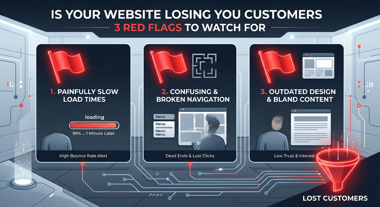
In the digital world, first impressions happen in milliseconds. If your site triggers any of these three major red flags, you aren't just missing out on sales—you are practically handing your customers over to your competitors. By investing in custom website development services, you can ensure your site is optimized for conversion from the ground up.
Let’s look at the red flags you need to watch for and how to fix them before you lose another lead.
Red Flag #1: The 3-Second Stare (Slow Load Times)
We live in an era of absolute impatience. If your website takes longer than a few seconds to load, it doesn't matter how beautiful your design is or how revolutionary your product is—nobody is staying around to see it.
Think about your own browsing habits. When you click a link and hit a blank white screen that slowly pieces itself together like a 90s dial-up connection, what do you do? You hit the back button. Your customers do exactly the same.
Why It’s Killing Your Business
Google’s data shows that as page load time goes from 1 second to 3 seconds, the probability of a visitor bouncing increases by 32%. If it takes 5 seconds, that probability jumps to a staggering 90% redesign my website SEO friendly.
Slow websites don't just frustrate people; they also frustrate search engines. Google prioritizes user experience, meaning a sluggish site will actively tank your SEO rankings, making you invisible to new traffic.
The Fix: Lighten the Load
Compress Your Images: Giant, unoptimized image files are the absolute biggest cause of website bloat. Use tools like TinyPNG or convert your images to modern formats like WebP to reduce file sizes without losing quality.
Audit Your Plugins: If you use WordPress or Shopify, look at your extensions. Every single plugin adds code that your site has to load. If you aren't actively using it, delete it.
Upgrade Your Hosting: Cheap shared hosting is fine when you are starting out, but as your traffic grows, you need a host that can handle the load. Upgrading to a virtual private server (VPS) or cloud hosting can instantly shave seconds off your load time.
Red Flag #2: The "Where Do I Click?" Dilemma (Confused Navigation)
When someone lands on your homepage, they should immediately know two things: what you do and what they need to do next.
Too many business owners try to get overly creative with their website layout. They use clever, vague language for their menu titles (like "Our Universe" instead of "About Us") or they hide their contact information deep in a sub-menu. If a user has to play detective to figure out how to buy from you, they will leave.
Why It’s Killing Your Business
Confusion is the ultimate conversion killer. Economists call this "cognitive load"—the amount of mental effort it takes to process information. The higher the cognitive load on your website, the faster people give up.
If your call-to-action (CTA) buttons are blending into the background, or if you have five different buttons screaming for attention on the same page, your visitor will experience decision paralysis.
The Fix: Streamline the Journey
Stick to Standard Conventions: Don’t reinvent the wheel. Put your logo in the top left, your menu across the top, and your shopping cart or contact button in the top right. This is where users expect them to be.
Embrace the "One Clear Goal" Rule: Every page on your site should have a single, primary objective. If it’s a service page, the goal is "Book a Call." If it’s a product page, it’s "Add to Cart." Make that specific button stand out using a contrasting color.
Declutter Your Menu: Limit your main navigation bar to five or six essential links. Everything else can go into the footer at the bottom of the page.
Red Flag #3: The Mobile Mismatch (Poor Mobile Experience)
Take a look at your website analytics right now, and there is a massive chance that well over half of your traffic is coming from smartphones and tablets.
Yet, so many businesses still design their websites exclusively on a giant desktop monitor, treating the mobile version as a minor afterthought. If your text is too small to read on a phone, or if your checkout buttons require tiny, surgical thumb-precision to press, you are alienating more than half of your potential market.
Why It’s Killing Your Business need website developer urgent
A site that looks "okay" on a desktop but breaks on a phone sends a clear message: we don't care about your experience.
Pop-ups that block the entire screen and can't be closed, text overlapping over images, and forms with tiny input fields will drive mobile users insane. Furthermore, Google uses mobile-first indexing, meaning it evaluates your website’s health and ranking based on how well it performs on a phone, not a computer.
The Fix: Think Mobile-First
Test it Yourself: Grab your own phone and try to fill out your contact form or buy one of your own products. Is it easy? Does it make you want to throw your phone across the room? Real-world testing reveals gaps that automated tools miss.
Ditch the Tiny Text: Ensure your base body font size is at least 16px so users don’t have to pinch and zoom just to read your blog posts or product descriptions.
Give Buttons Breathing Room: Make sure your buttons are large enough to be easily tapped with a thumb (at least 48x48 pixels) and leave plenty of whitespace around them so users don't accidentally click the wrong link.
The Ultimate Website Health Check
If you aren't sure where your website stands, don't worry. You don't need an expensive tech degree to audit your site. Start with these three quick, free tests to see exactly what your customers are experiencing:
Test Type
Tool to Use
What to Look For
Speed Test
Google PageSpeed Insights
Aim for a performance score above 80 and a load time under 2.5 seconds.
The 5-Second Test
Show your homepage to a friend for 5 seconds, then close it.
Ask them: "What do I sell?" and "How do you buy it?" If they can't answer, your messaging is too complicated.
Form Check
Your own smartphone
Go through your contact/checkout flow on your phone. Count how many clicks it takes. Try to cut that number in half.
Your Website Should Be Your Best Salesperson
Your website shouldn't just be an expensive, digital business card that sits there looking pretty. It needs to act as your 24/7 salesperson—welcoming people in, answering their questions clearly, and guiding them smoothly toward a purchase.
If your traffic is solid but your sales are flat, stop tweaking your marketing campaigns for a moment and look at the foundation. Fix the speed, clear out the confusion, optimize for the phone in your customer's hand, and watch how quickly those disappearing visitors turn into loyal customers.